
Shipped: a store locator for the 42M people on SNAP
EBT Finder: UX Case Study
A review-first store locator that helps SNAP/EBT users find nearby businesses with confidence and dignity. Researched, designed, built, and shipped solo to the App Store.
- Role
- Product Designer and Developer (solo)
- Timeline
- 4-week design sprint, then built and shipped to the App Store
- Tools
- Figma, User Interviews, Prototyping, React, Supabase, Capacitor
- EBT-accepting locations mapped, 53 states and territories
- 264k+
- US users in the last 28 days
- 1,470
- live on the iOS App Store, run solo
- Shipped
At a glance
- Problem
- The official SNAP locator is a CSV on a map. People stand in the aisle not knowing if a store takes EBT.
- Solution
- A store finder built from interviews: hot-food filter, real photos and shopper confirmations, usable on one bar of signal.
- Outcome
- Live on the App Store and the web: 264,000+ locations in 53 states and territories, 1,470 web users in the last 28 days.
Shipped
From prototype to the App Store
EBT Finder didn't stop at the prototype. I built the product in React with a Supabase backend, wrapped it with Capacitor, and released it on the iOS App Store. The research below shaped the first version. Everything since has been shaped by running it: real data pipelines, a real App Store review, real crashes, and users on weak connections.
- EBT-accepting locations mapped across 53 states and territories
- 264,000+
- US users on the web app in the last 28 days
- 1,470
- shoppers have confirmed or flagged a store's EBT status
- 49
- TestFlight builds to reach a clean release
- 13
Sources: production database, Google Analytics (Sep 14 – Oct 11, 2026), verification records, release log. Locations and builds read 2026-09-18; users and verifications read 2026-10-12.
- Status
- Live on the App Store (1.0.2) and at ebtfinder.org
- Built with
- React, TypeScript, Supabase (Postgres, RLS, 20 edge functions), Google Places API, Capacitor
- Data
- USDA SNAP retailer dataset synced on a schedule, enriched with Google Places, plus community verifications
- Team
- Solo: research, design, code, backend, release and support
The live app
Screens from the shipped iPhone app. Swipe on a phone; select one to see it full size.
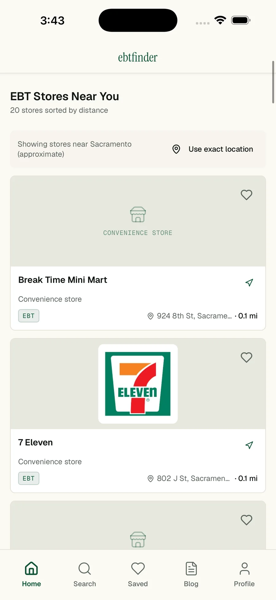
Opens to EBT stores near you, sorted by distance, with one tap to use your exact location.
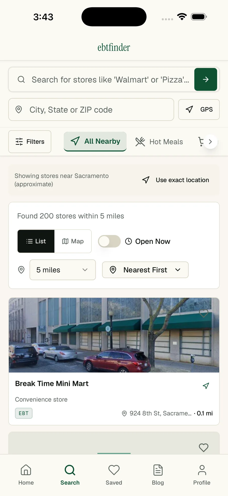
Search by store or place, with Hot Meals, Open Now, distance and sort filters.
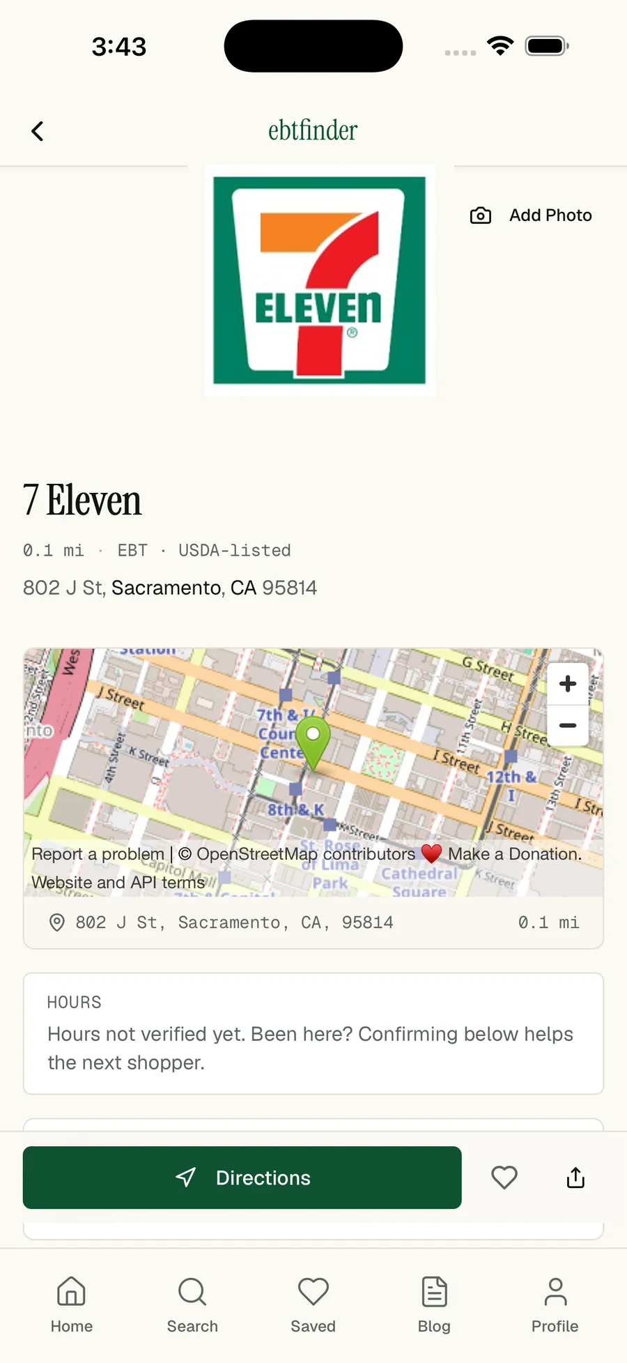
A store page answers fast: USDA listing, distance, map, hours and directions.
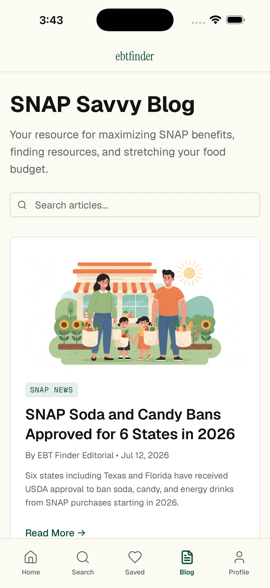
SNAP Savvy: the guides and news that bring people in from search.
The Problem
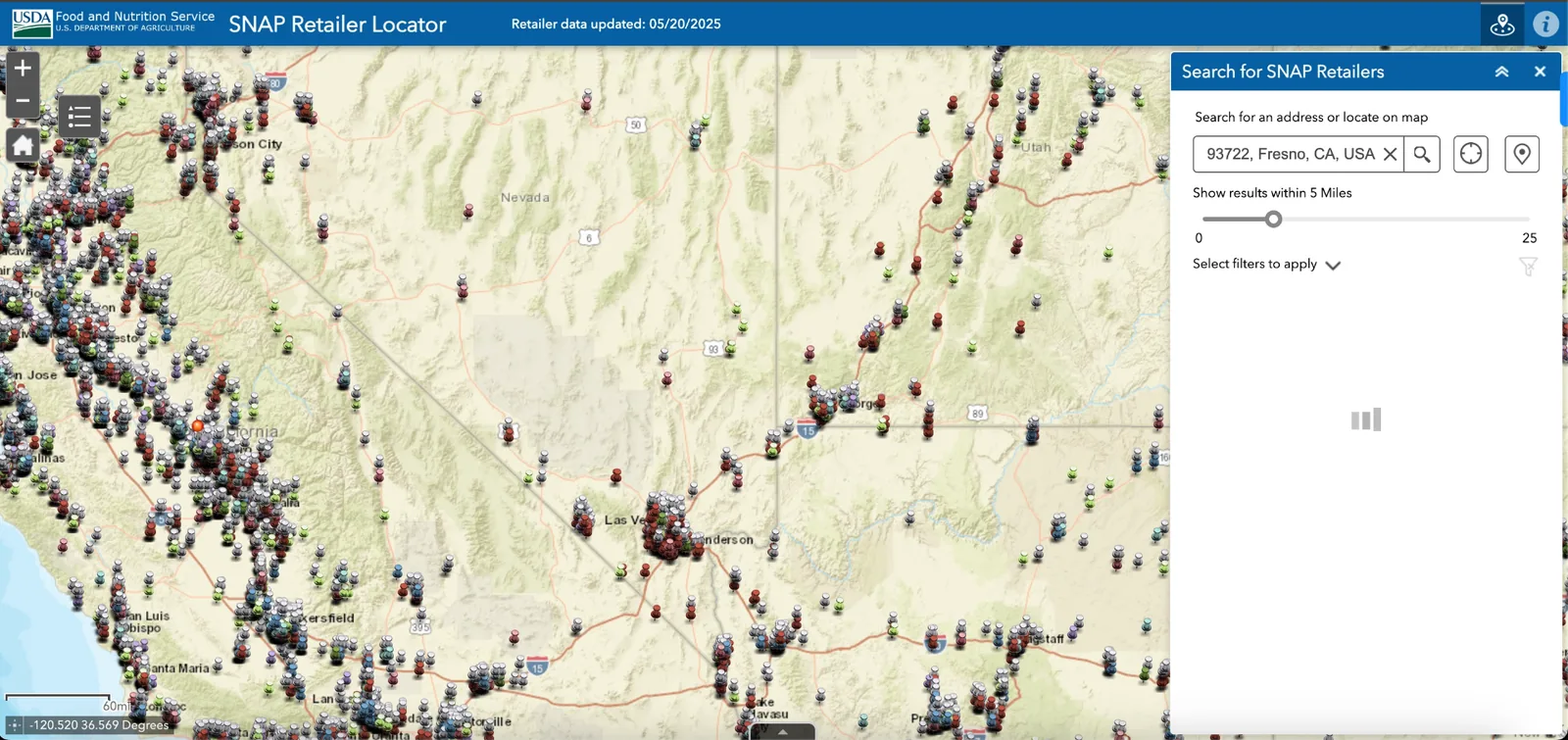
The official locator is a CSV on a map
Low-income families using EBT are underserved by digital tools. The USDA's SNAP Retailer Locator is failing them.
- Is overwhelming and outdated
- Lacks visuals, reviews, or trust signals
- Isn't mobile-first
- Can't filter by user needs (hot food, delivery, open now)
Impact
Users avoid using the tool entirely. Over 40% of Fresno's EBT-eligible businesses had no reviews or public presence, making it impossible for users to know if a store truly welcomes them.
Competitive audit (USDA locator, Google Maps, Yelp, Propel): no single platform combined snap eligibility with real-time visuals and user reviews.
Research
Seven interviews, three findings, five decisions
To ground the experience in real needs, I interviewed 7 EBT users in Fresno over 4 days, including single parents, seniors, and working adults. I later ran moderated usability tests of the prototype with 10 people.
Lack of Trust in Store Listings
"Just because a store says they take EBT doesn't mean they actually do when you get there."
Users need social proof (reviews, photos, and community validation) before trying a new store.
Confusion Around Hot Foods
"I've had EBT for years and still don't know where I can use it for hot food."
Hot food eligibility varies by state and is poorly communicated. Even long-time users don't understand the rules.
Stigma + Shame Still Exist
"I don't want to be judged when I swipe my card. Knowing a place welcomes EBT helps."
Knowing a business explicitly welcomes EBT users reduces anxiety and shame. Dignity matters.
What users said, and what it became
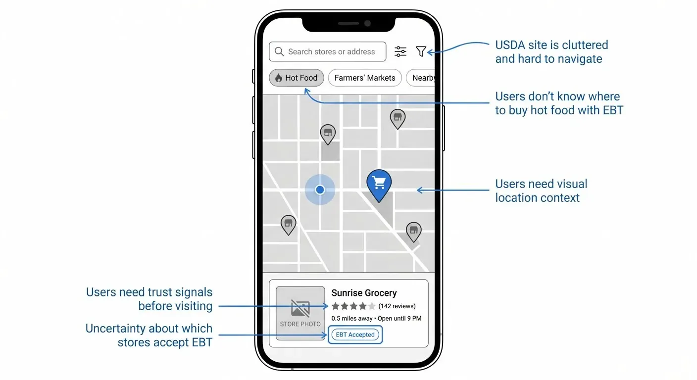
- "I need to know if this store actually takes EBT"
- Reviews + Ratings: User-generated reviews specifically about EBT acceptance
- "I don't know where I can buy hot food"
- Hot Food Filter: Clear category filtering + educational tooltips per state
- "I don't want to be embarrassed"
- Visual Trust Signals: Real photos, high ratings, and "EBT-Friendly" badges
- "The USDA site is too cluttered"
- Clean, Mobile-First UI: Simple search, clear filters, map view
- "I need to see what the store looks like"
- Google Places API Integration: Pull in real business photos automatically
| User need | Design decision |
|---|---|
| "I need to know if this store actually takes EBT" | Reviews + Ratings: User-generated reviews specifically about EBT acceptance |
| "I don't know where I can buy hot food" | Hot Food Filter: Clear category filtering + educational tooltips per state |
| "I don't want to be embarrassed" | Visual Trust Signals: Real photos, high ratings, and "EBT-Friendly" badges |
| "The USDA site is too cluttered" | Clean, Mobile-First UI: Simple search, clear filters, map view |
| "I need to see what the store looks like" | Google Places API Integration: Pull in real business photos automatically |
The Solution
Reviews, real photos and a hot-food filter
The search and filter flow is the interactive prototype at the top of this page. The features below are what turn a search result into a store a person will actually walk into.
1. Mobile-First Search & Filters
Users can search by location and filter by category.
- Hot Food / Fast Food
- Grocery Stores
- Bakery
- Farmers Markets
- Delivery options
- "Open Now"
Why it matters: Filtering = dignity. Users aren't looking for "any" EBT store; they want the right fit for their needs.
2. Visual Business Profiles with Reviews
Each listing includes real photos, reviews, and clear EBT acceptance info.
- Real photos from Google Places API
- User reviews and ratings
- Address and hours
- Clear "ACCEPTS SNAP FOOD AND SNAP HOT FOOD" callouts
- EBT-friendliness score
Why it matters: Trust matters more than features. Visual confirmation and peer reviews give users confidence before visiting.
3. Map View with EBT-Only Results
Unlike Google Maps or Yelp, EBT Finder shows only USDA-authorized SNAP retailers, and marks the ones shoppers have recently confirmed. No noise, no confusion.
Why it matters: Government tools ignore real workflows. Users need focused, relevant results, not a cluttered database.
4. Community-Driven Trust
Users can contribute to the platform and help others.
- Share short reviews
- Rate EBT-friendliness
- Upload photos
- See recently viewed stores
Why it matters: Peer-to-peer trust is more powerful than any official label. Real people vouching for real experiences.
Validation
9 of 10 found hot food in under 15 seconds
Before writing production code, I ran moderated usability tests with 10 participants, each asked to find a hot food location near them in EBT Finder and in the USDA locator. All four numbers below come from that one session; the production usage figures are at the top of this page.
- Task success
- 9 of 10
- testers found a hot food location in under 15 seconds, against 3+ minutes on the USDA site
- Preference
- 10 of 10
- testers said they would use EBT Finder over the USDA tool
- Confidence
- 8 of 10
- testers felt more confident visiting a store after seeing its reviews and photos
- Time to find hot food
- 12x faster
- median 15 seconds in EBT Finder versus 180 seconds on the USDA locator
Marketing
How I market it
Shipping is half the job. I also run distribution: the App Store listing, search, content and partners. It is the same research, applied to how people find the product instead of how they use it.
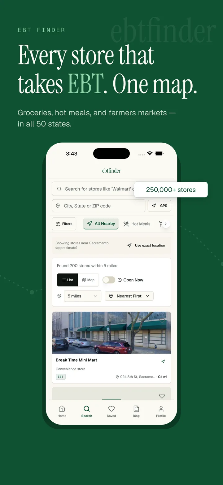
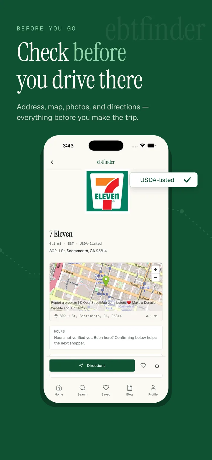
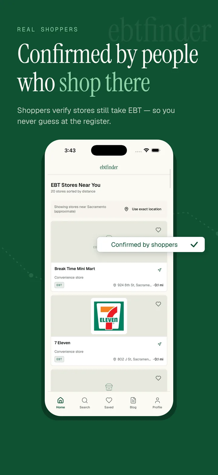
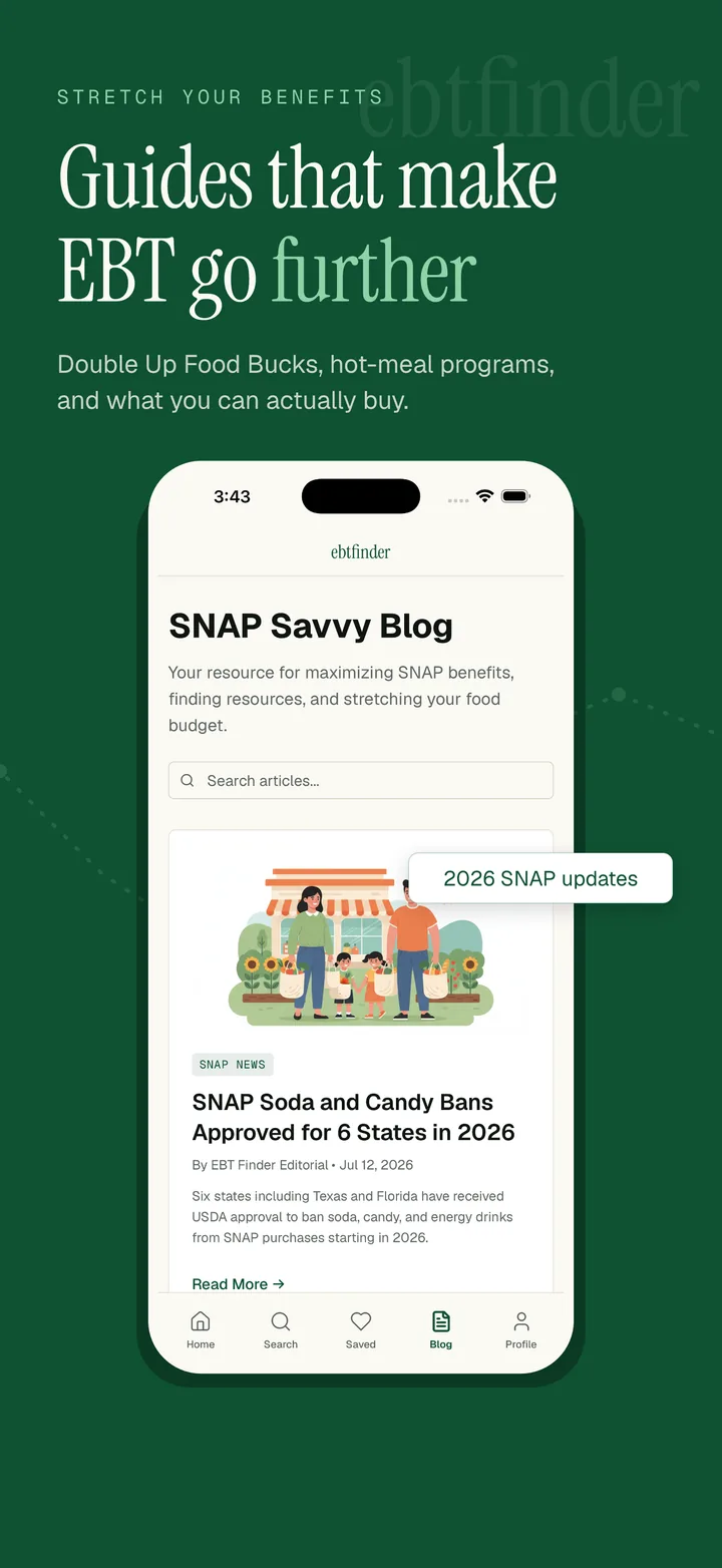
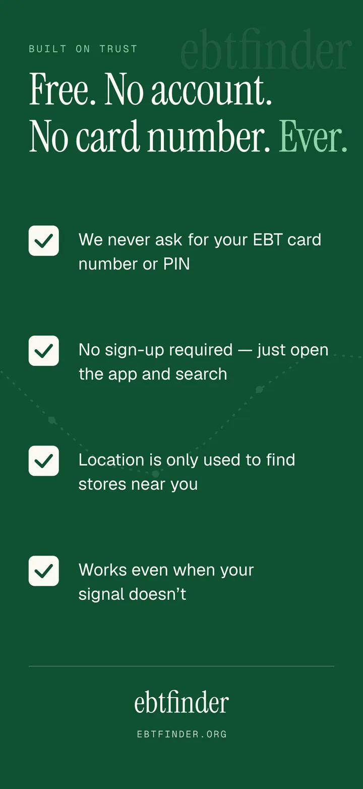
The App Store screenshots I designed for the listing: one benefit per frame. Swipe for all five on a phone.
App Store
The listing is an ad
I designed the store screenshots above as marketing frames, one benefit each, in the words people used in interviews. The subtitle and keywords match how people actually search: food stamps, CalFresh, hot food, WIC. On the web, a Smart App Banner sends iPhone visitors to the listing.
7 designed store screenshots
Search
A landing page for every state and major city
Prerendered pages for every state, 121 cities and the questions people type, like “Does Walmart take EBT?”, plus a store sitemap with structured data so results can show EBT acceptance.
198 search landing pages
Content
SNAP guides on a steady schedule
Guides and SNAP news publish twice a week. I cut it from daily once quality mattered more than volume. The site works in English and Spanish.
2 posts a week, English and Spanish
Partners
Distribution through people users already trust
An embeddable city widget that food banks and 211 sites can put on their own pages, with tracked links back, and an outreach plan aimed at 211 networks, food banks and SNAP-Ed.
26 partner organizations targeted
What I don't do: marketing push notifications. A notification only sends if it saves someone a wasted trip or wasted money.
Running It
What broke after launch, and what I did about it
A prototype never meets a changed API, an App Review rejection or a user with one bar of signal. The product did. These are the problems that mattered, each with the decision behind the fix.
Google changed the shape of its data and took down every store page
- What happened:
- Google Places moved reviews from one JSON shape to another. Rows written before and after the change coexisted in the same column. Rendering the new shape crashed every enriched store page; a SQL filter reading the old key silently dropped new-shape stores from Open Now results.
- What I did:
- Normalized both shapes at one boundary, guarded every render of external data, made the SQL read both keys, and locked it with a regression test built from the actual crashing row.
- What it taught me:
- The database stores whatever shape the API had on the day each row was written. Every consumer, client and SQL, has to handle both, forever.
Users open the app where the signal is worst
- What happened:
- The core use is standing in a store with one bar. Queries returned empty on network failure and the app showed nothing.
- What I did:
- A last-good-result cache keyed on the full query identity (bucketed location plus every filter), so an area with zero results shows zero and never another area's cache. Fresh data always wins; the cache only speaks when the network can't.
- What it taught me:
- Offline support is a product decision about which screens must work, not a technical checkbox.
Apple rejected the build for a bug that wasn't in the build
- What happened:
- App Review reported that account creation failed. The cause was a database trigger referencing a column I had removed: every new sign-up returned a 500, which the app surfaced as the error the reviewer saw.
- What I did:
- Fixed the trigger server-side, reproduced the sign-up on a physical device against the same build, and replied to the Resolution Center with the root cause and evidence. No new binary was needed.
- What it taught me:
- The backend is a shared artery. A schema change hits the website and every installed build at once, so server changes must be additive and tested against shipped versions.
Thirteen TestFlight builds to a clean release
- What happened:
- The 1.0.2 redesign found its native-UX bugs on the phone, after upload: a sticky header that never stuck, dead-tap card images, a login screen with a manufactured scroll region, GPS refresh that navigated away instead of updating inline.
- What I did:
- Turned every bug class into a written rule and a pre-archive audit at phone dimensions (safe areas owned by one component each, 44pt targets, one tap target per card, inline refresh with skeletons). Later releases audit before they archive.
- What it taught me:
- Every rule in that checklist is a build that cost a day. The discipline is auditing before the archive exists.
Notifications that respect people who are stretched thin
- What happened:
- Push is the easiest way to look engaged and the fastest way to lose trust with users who are checking their benefits, not browsing.
- What I did:
- A standing policy: a notification sends only if it saves a wasted trip or wasted money. Two are allowed (a saved store may have stopped taking EBT; an opt-in proximity alert), permission is asked right after the first favorite, never at launch, and there are no marketing or re-engagement pushes at all.
- What it taught me:
- Attention is not an engagement metric. For this audience, restraint is the feature.
What I Learned
What I learned, and what I'd change
Trust is UX. Users don't care about feature count; they care about confidence. Visuals, reviews, and community feedback drive trust more than any official dataset.
Government tools ignore real workflows. The USDA SNAP locator serves as a database, not a usable product. It fails on mobile, lacks accessibility, and assumes users will do all the work.
Filtering equals dignity. People aren't just looking for "any" EBT store. They want the right fit: hot meals, open hours, safety, distance, and welcoming staff.
Designing for underserved users requires humility. You can't assume you know what matters most until you talk to people living through the experience.
What I'd do differently
Expand merchant research. I focused heavily on user needs but should have interviewed more small business owners to understand barriers to EBT adoption. This would strengthen the business model.
Test with broader demographics. My 7 interviewees and 10 testers were valuable, but I'd include more rural users, non-English speakers, and users with disabilities to ensure accessibility.
Build in educational content earlier. Hot food eligibility is confusing. I should have designed state-specific tooltips and FAQ content into the MVP, not as a "next step."
Next project
BelesHiring for a senior UX role?